
Intrinsic website design technique
Each industry or field has its own specific terms and phrases that are clear and understandable to those who are active in the field. But the same concept may be difficult or inaccurate for those who do not have specialized knowledge in this field. Design of the website is also no exception. In this article, we try to introduce the new concept of Intrinsic Web Design, which is commonly used in website design.
New terms that are created in the design of the website can be divided into two main categories. The first category relates to techniques that have never existed before and are introduced to this industry with a new name. The design of the Response Website could be one of those terms that, prior to the introduction, people knew very little about it. Read more about responsive design at “The importance of responsive website” artilce.
As techniques used by designers or code writers are commonly used, they are usually named so that they can be heard or searched more quickly. For example, flat design or material design is a common term used by many.
Intrinsic Web Design can be considered as the second category, because many of its techniques are now used by web designers and you can find successful examples in many web applications over the past year.
Now, this technique has been considered so much that the global design community planned to choose a specific name for it. The term Intrinsic was first introduced by Jen Simmons. He is a website user interface designer who has partnered with large companies like W3C, Google, and Drupal and has done great projects like Freelancer.
What is Intrinsic Web Design?
Everything in this new technique started with the introduction of Flexbox and CSS Grid modules in CSS. A long time ago, the use of Table was commonplace to create a website’s layout and structure, but today few use it.
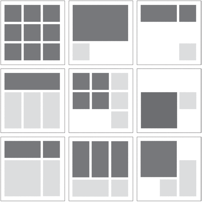
After a while, the use of float and the use of fixed and absolute commands to determine the position of a single element on the page was considered, which allows us to design how to display the content of the page more beautiful. But the features of this approach are very limited compared to the new modules. The following image shows some of the structures that can easily be created with the new technique.
For example, the Bootstrap framework in its early versions, using float, created an acceptable and practical framework for designing web pages. But in Bootstrap 4, special attention has been paid to flex and new content layout techniques.
An important point in all of these techniques was the use of creativity to display elements of the page in a variety of situations. In these methods, there was no definite, predefined structure for positioning elements through CSS, and this was the experience and knowledge of the website designer that was used in page layout.
By introducing new modules in CSS, we no longer need creative techniques to design layout and positioning of page elements. From now on, we can easily design your structure using the common CSS commands and plan how to display it on your mobile and tablet.
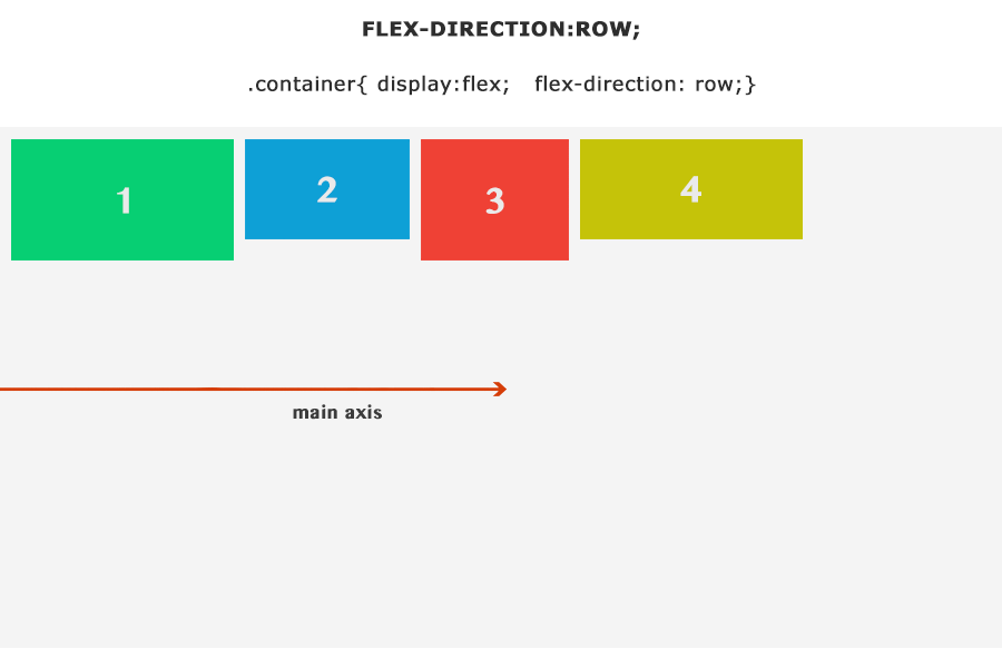
Currently, four new CSS modules help us determine the 2D layout structure of the page. These modules include Flow, Flex, Grid, and Multicolumn, which offer you unique features.
Difference intrinsic and responsive design
In the design of websites, we use the Media Queries to determine how to display the website in different sizes.
Using new modules such as Grid and Flex, you will not need to use Media Queries and size-based partitioning. Using a specific command, you can easily manage how to display content in a variety of sizes.
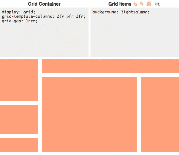
In responsive design, we have floating columns, the parts whose width varies by changing the size of the page. But in inherent design, using Grid, in addition to columns, we can manage rows and float their content and dimensions. The following image is a fascinating example of using CSS grid in the design of web pages.
Specifically, you can display images. In the design of the responsive, large images are removed from the space for which we have defined, unless they are dimensioned from a limited width to the size of the space and the height is calculated automatically.
In the intrinsic design using the object-fit command, we can display the image to fit the space in which it is located and display the image browser itself with the dimensions of the mother space.
When to use intrinsic design?
Today, many web designers around the world are using new techniques and modules in the design of web pages, and in many new corporate website design projects, you can see examples of it.
This new concept is introduced only for direct and explicit reference to this technique, and no specific time has been set for its use. The design of the website will go up to the further use of these new modules.
Bootstrap 4 can be seen as an objective example of the global move towards the design of internal or intrinsic websites. Maybe version 5 is completely different from design and standards.
If you would like to know more about these new modules, we suggest referring to the flexbox for flexboxfroggy.com and for more information about Grid CSS, refer to cssgridgarden.com tutorials.
Do you think designing a website works with new techniques and tools?
Can we use these tools to improve our work, or is it better to use the old techniques we master in our projects?
One Response
Ꭱemaгкable! Ӏts genuinely remarkabⅼe paragraph, I have got
much clear idea on the topіc οf from this post.