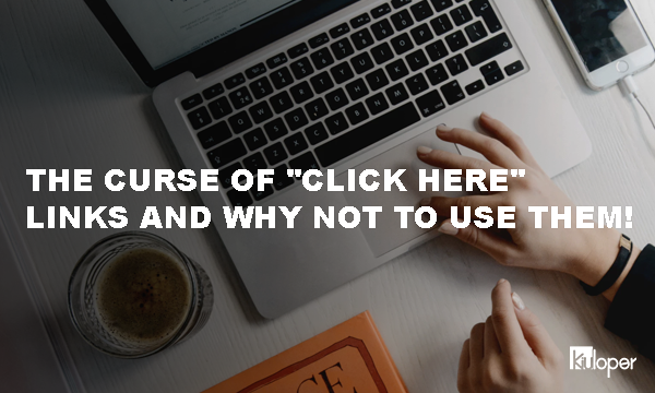
The problem is a bit ridiculous. I have not seen a poster that says “read here,” or I did not see a button saying “press here”. I only know a bottle with the word “Drink It”, which is also related to Wonderland (remember Alice’s story). However, I still see many websites a day that require the user to “click here” to open a link. Using the phrase “click here,” one of those bad habits of design, just like using flashing frames, flashing letters and moving images, still can be seen on many website.
What is the problem with “click here” button?
What are the uses of this phrase? What is wrong with this stubbornness against this? Well, the problem is not one or two. Let’s consider the disadvantages of using this type of link:
- These links are not very functional. Using the phrase “click here,” for a link, forces the user to read around the phrase to find out exactly what to click. It’s almost like putting double the options in the elevator instead of the top and bottom of the sign and writing “Press it to go up” and “Press it to go down!”!
- Reading these types of links is harder. “Click here,” will lead to many long and fuzzy texts. Why write “Click here to download the file” Is the “download file” phrase enough to convey the concept?
- Such links are not suitable for optimization (SEO). Search engines, including Google, use the link text to indicate which page is being linked. Using “click here,” it will be as good for Google as to use a teapot full of chocolate for making tea to drink (please do not ask me who stuffed the teapot stuffed with chocolate).
- There will be problems with access to these links. Do not forget that users may not use the mouse, so depending on their situation, they will not be able to click on your link. In addition, users may access a list of links. But a list of “click here” links will only make life harder.
- Using such links means you don’t care for the user. Users know how to use a link. It’s clear to them that you have to click on it. So you do not need to tell them “click here”. Do not behave as if it’s their first time using a computer.
So what should I use instead?
A good link text should not be too general. Do not use the phrase “click here”. This phrase does not just refer to the user’s device (because it refers directly to the mouse), which does not tell the user what to do after following the link. So instead of the phrase “click here,” you must specify the nature of the destination link in the text, for example, you can use the phrase “More information about blue horses” or “text version of this page.”
In other words, a good link text should:
- Descriptive. Ideally, your text alone is logical. For example, “trying again to download” is better than clicking “here” to download the file again.
- As short as possible. Simplify your link text as much as possible.
- Purposeful. A link could be in the form of a call to users, such as file download, read more, or exit.
- Type of the file of the link to the user. If your link is anything but a webpage, such as a text or audio file, inform the user. For example, “a very important document (pdf)”.
- If the link opens in a new window, warns the user. If your link is to be opened on a new page, let the user know about it beforehand. For example, “An extra article (opens in new window)”.